

Kinetic Typographic Poster
A typographical poster promoting the two typefaces, FF-DIN and Bodoni. Research on both typefaces preceded the exploration of their letterforms, encompassing the creation of word expressions and 3D letters within each typeface. These elements were compiled into a poster that would later be animated in subsequent years.
Time frame: January 25th – February 17th 2021
November 22nd – 28th 2022
Media: Poster
Research:
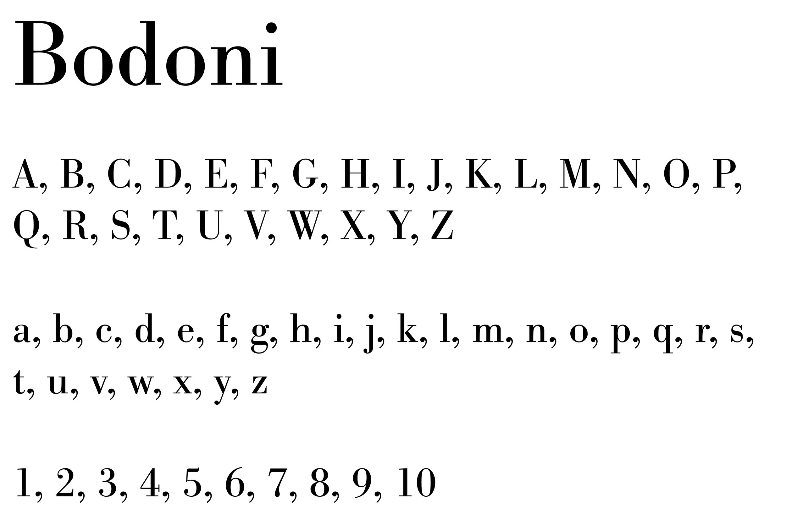
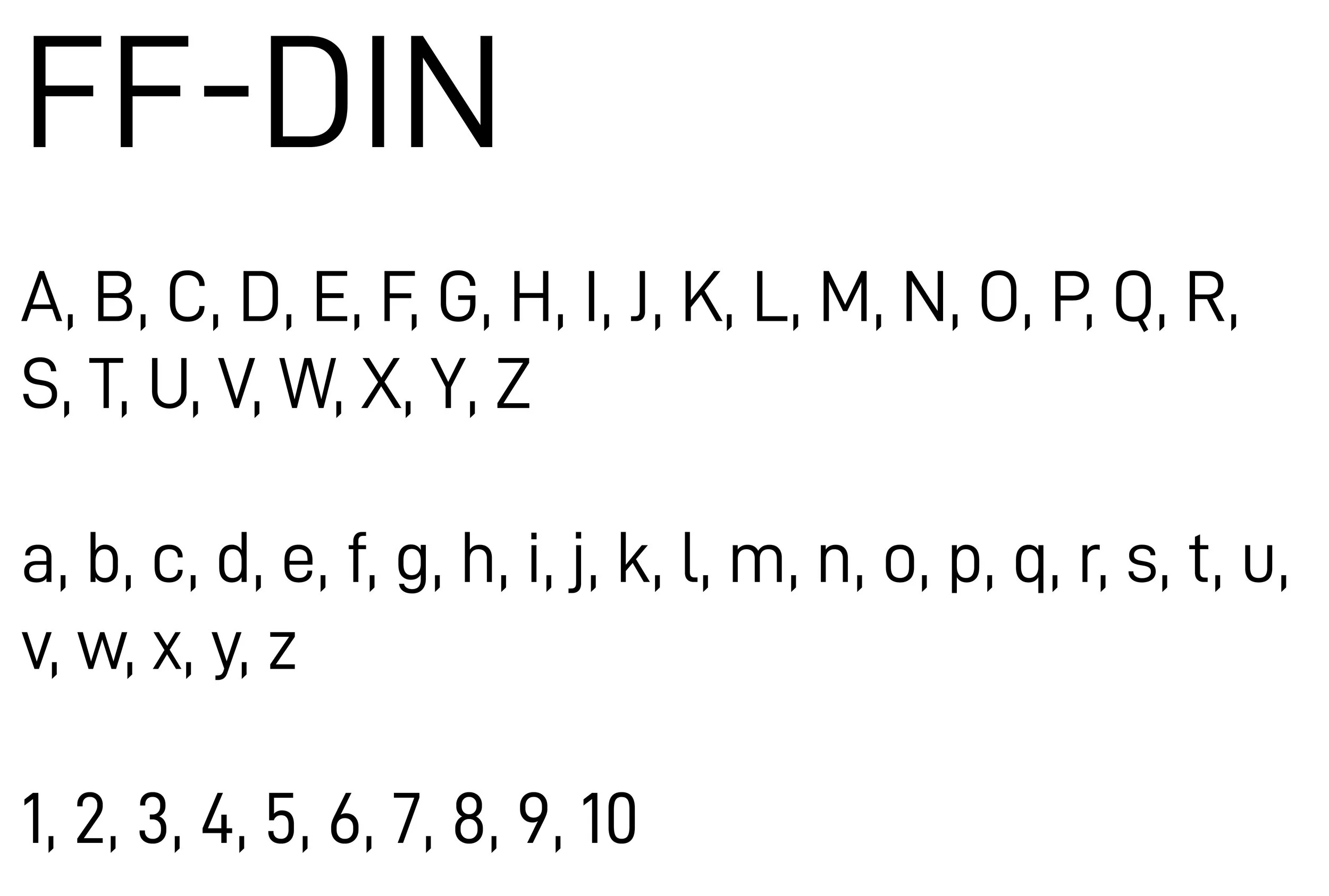
Research was conducted on two selected typefaces, Bodoni and DIN, one sans-serif and the other serif. The comprehensive exploration included details such as the designer, the year of design, and the historical and technical context from which each typeface emerged. Additionally, the research delved into the physical features characterizing each typeface.
Expressive Typography:
Utilizing the researched typefaces, the expressions of "Stoic" and "Pretentious" were conveyed through the spacing, sizing, and placement of letters employing various typographic production techniques.
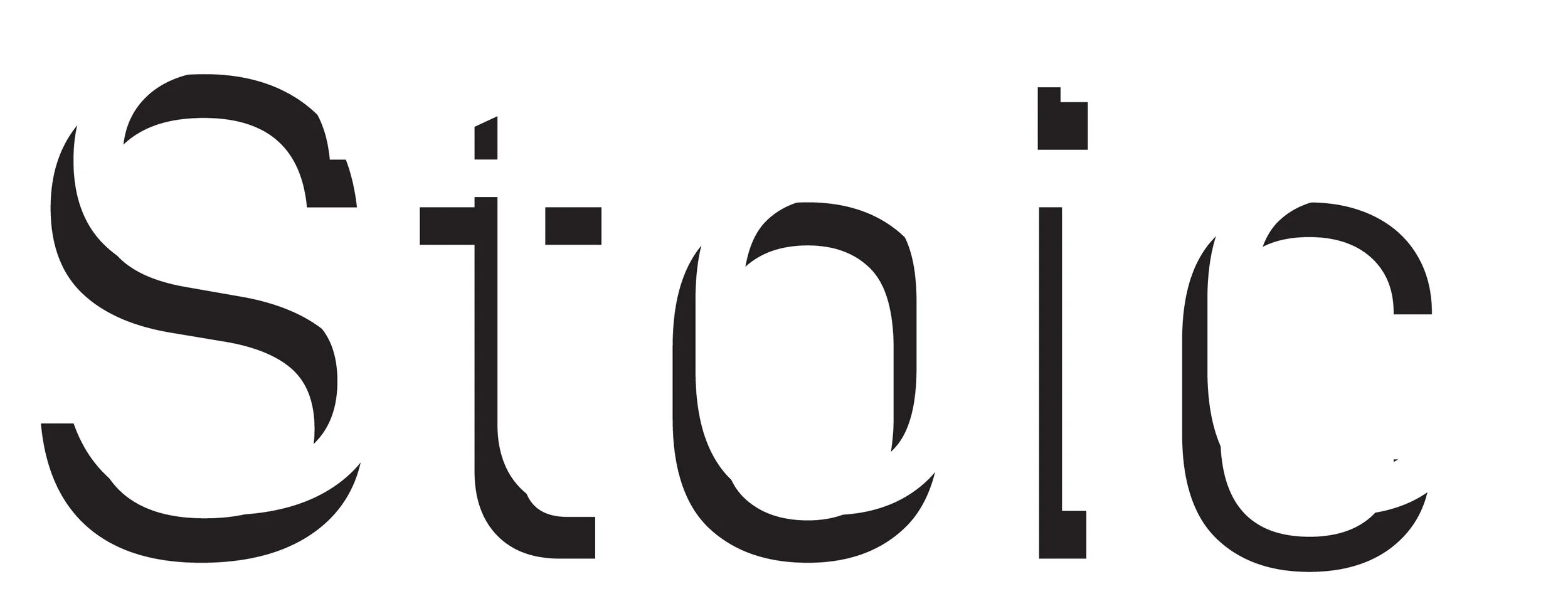
Definition: Not affected by or showing passion or feeling
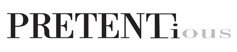
Definition: Expressive of affected, unwarranted, or exaggerated importance, worth, or stature
3D Letters:
Two uppercase letters from each of the researched typefaces were crafted in 3D using found materials. The letter "I" was constructed using iPhones, while the letter "J" was fashioned with jewelry. Once completed, a photo was taken from a bird's eye view in a well-lit setting.
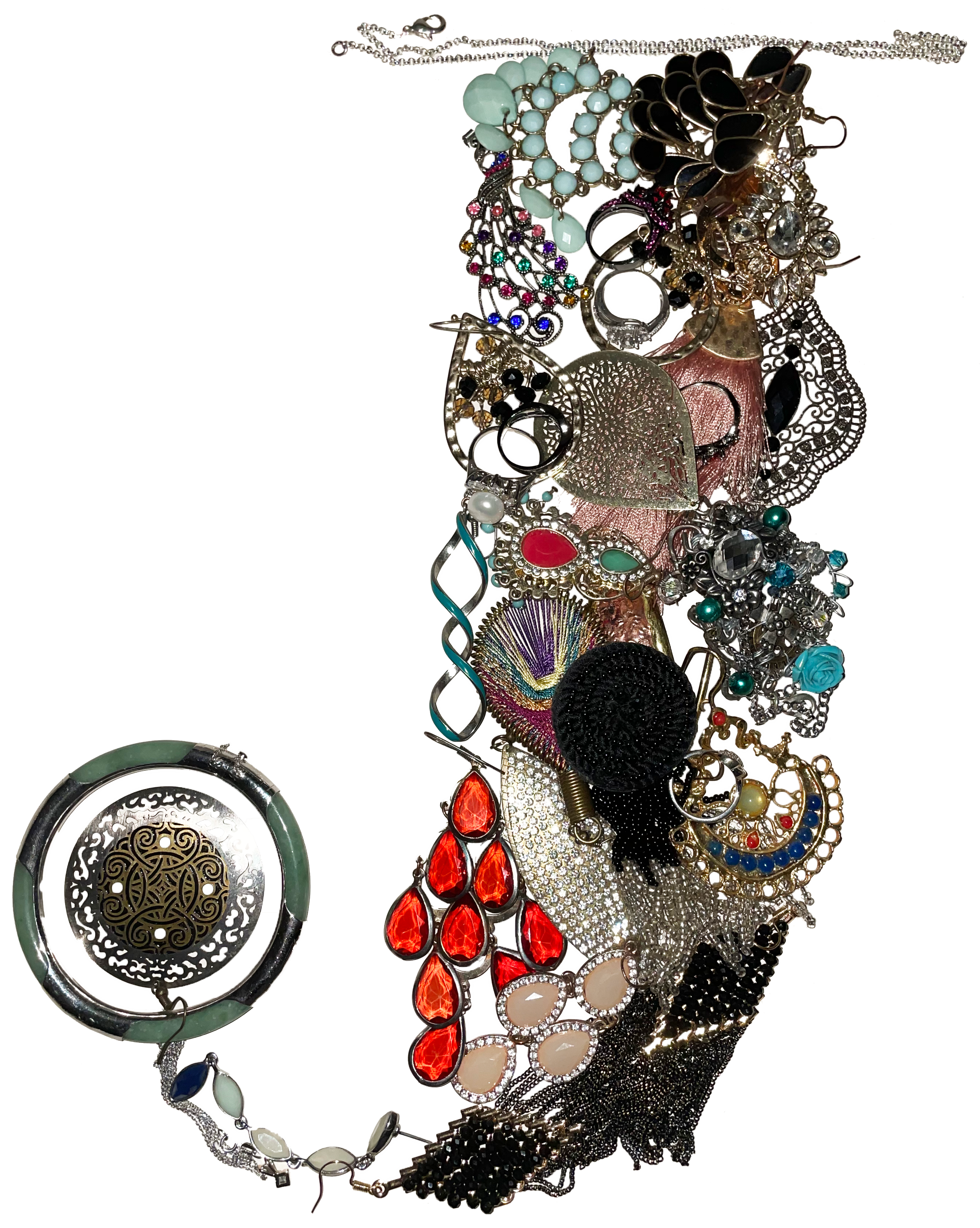
Bodoni's typeface, characterized by its stylish serifs that embellish thick and thin strokes, inspired a classy and refined letterform designed using jewelry. The choice of unique earrings, extravagant bracelets, and decorative rings felt fitting for creating this letterform.
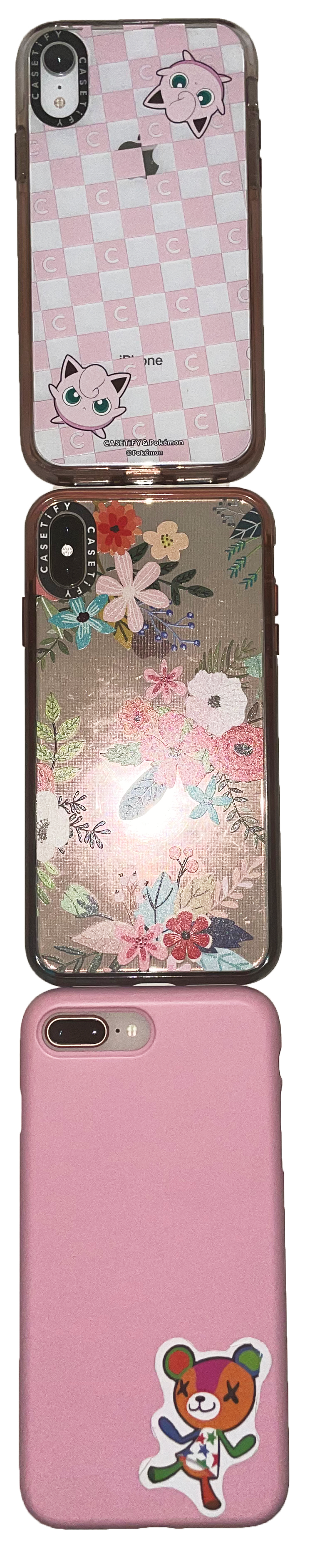
FF-DIN, a practical typeface with minimal adornments, was chosen to evoke a sense of unity and commonality. Recognizing smartphones as ubiquitous in society and often perceived as essential, the letterform for FF-DIN was crafted using iPhones.
Poster:
Once all the components were created, an artistic arrangement was devised to showcase each typeface's personality and how they express their historical and technological context. Additionally, the compositions highlight the distinctiveness between the typefaces, uncovering the relationships between different classifications of type.
Animation:
In 2022, the poster was elevated by animating it with After Effects and incorporating sound effects through Audition, creating an immersive experience. The animation features various moving parts, with additional motion introduced at the beat drop.